noxai design system
Overview
Working at Collidr has always been an exciting challenge, but until we started the Noxai project, it was mostly dealing with pre-existing tools and the mess I inherited from previous high-turnover designers. My first year at the company was spent just making the existing app feel somewhat consistent. Eventually, we started work on a new product aimed at self-service financial experts (not as boring as it sounds).
We learned from the mistakes and mess I inherited - a jumble caused by the lack of any sort of design documentation or system. Due to the highly specific nature of the app and niche requirements, we decided to create a bespoke design system from scratch.
Details
Starting from Zero
Unlike many projects where you might grab an existing system like Material UI or Tailwind and customize it, Noxai needed something different. Financial experts have specific needs that don't always fit neatly into general-purpose design systems - things like complex data visualization, specialized input fields, and compliance-focused UI elements.
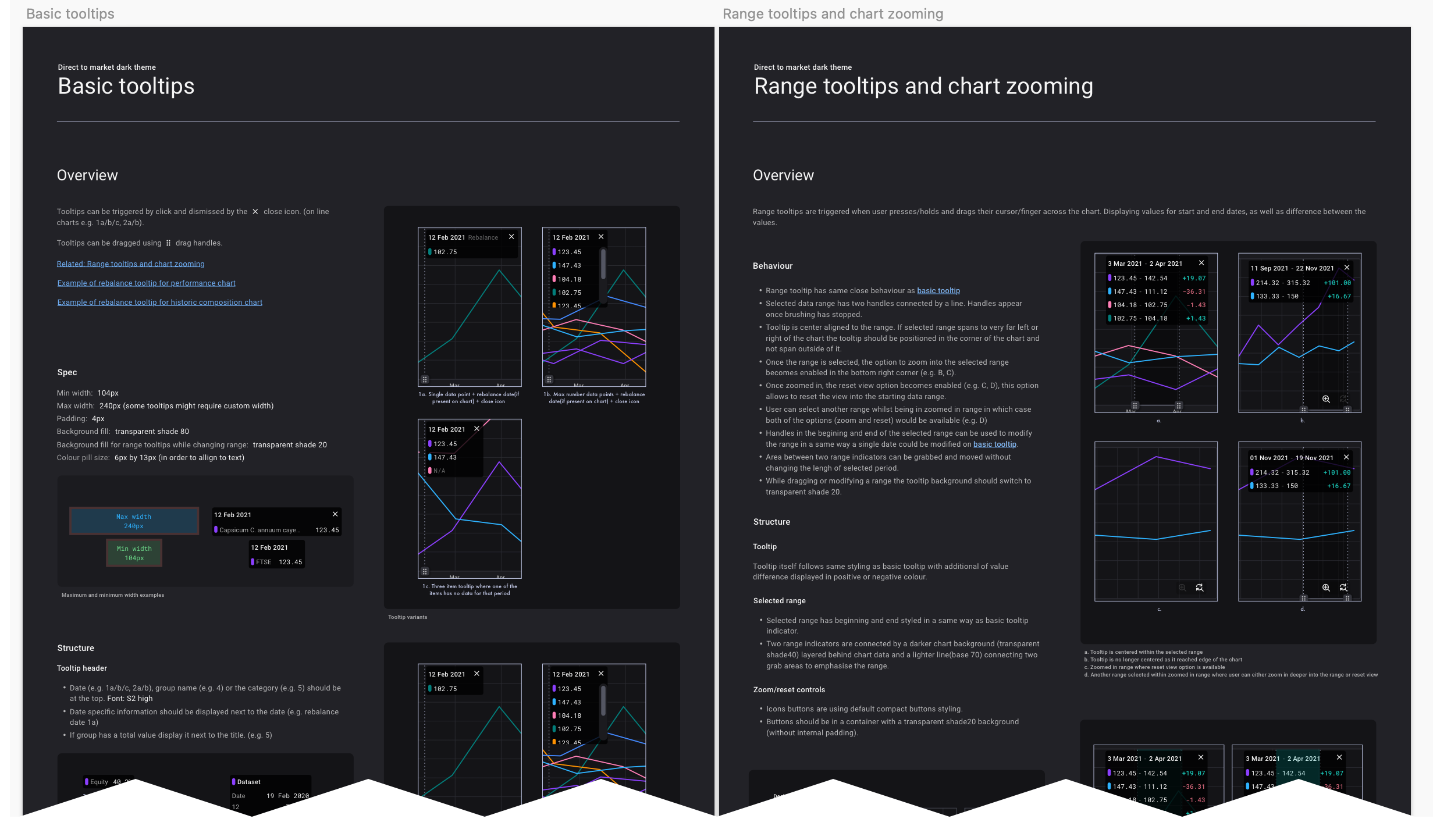
I started by mapping out all the unique components we'd need. This wasn't just buttons and form fields - we needed specialized charts, risk indicators, portfolio analysers, and a whole set of components that would let users manipulate financial data in sophisticated ways.
The initial challenge was balancing visual appeal with the hardcore functionality our users needed. These weren't casual users - they were professionals who would spend hours in this application making critical financial decisions.
The Sketch Phase
The first draft of the system came to life in Sketch. I chose it initially because:
I could quickly prototype and iterate
The symbol system let me build a nested component hierarchy
It was what company was using previously and all of existing files were done in.
Creating the initial component library took about three weeks of solid work. The process looked something like:
Build core elements (buttons, inputs, selections)
Create specialised financial components (charts, risk meters, etc.)
Establish spacing systems and grid structures
Define typography that would work for both data-heavy displays and readable content
Create a color system that supported both branding and functional needs (alerts, successes, warnings)
The most challenging part was creating components that could handle extreme edge cases - what happens when a user has 100+ items in a portfolio? How do we display negative values that stretch beyond expected ranges?
Documentation: Making It Stick
With the components taking shape, I knew documentation would be critical. The previous system had failed partly because nobody knew how to use it consistently. I created:
Component guidelines with clear usage rules
Spacing and grid documentation
Interactive examples showing states and variations
Edge case handling instructions
This documentation wasn't just a design reference - it became our shared language with the development team.
The Figma Migration
About halfway through the project, we made the decision to move from Sketch to Figma. This wasn't just following a trend - Figma offered:
Better collaboration with remote team members
More powerful component capabilities
Easier sharing with stakeholders
Better developer handoff features
Sketch started feeling very outdated in comparison
Porting the entire system to Figma was both a challenge and an opportunity. I had to rebuild many components, but this gave me a chance to refine them based on what we'd learned so far.
The migration took about two weeks of focused work, but the benefits were immediate. Easier ways to inspect elements, leaving comments, no need for exporting files out of sketch to a middleman such as invision.
Figma Variables: Game Changer
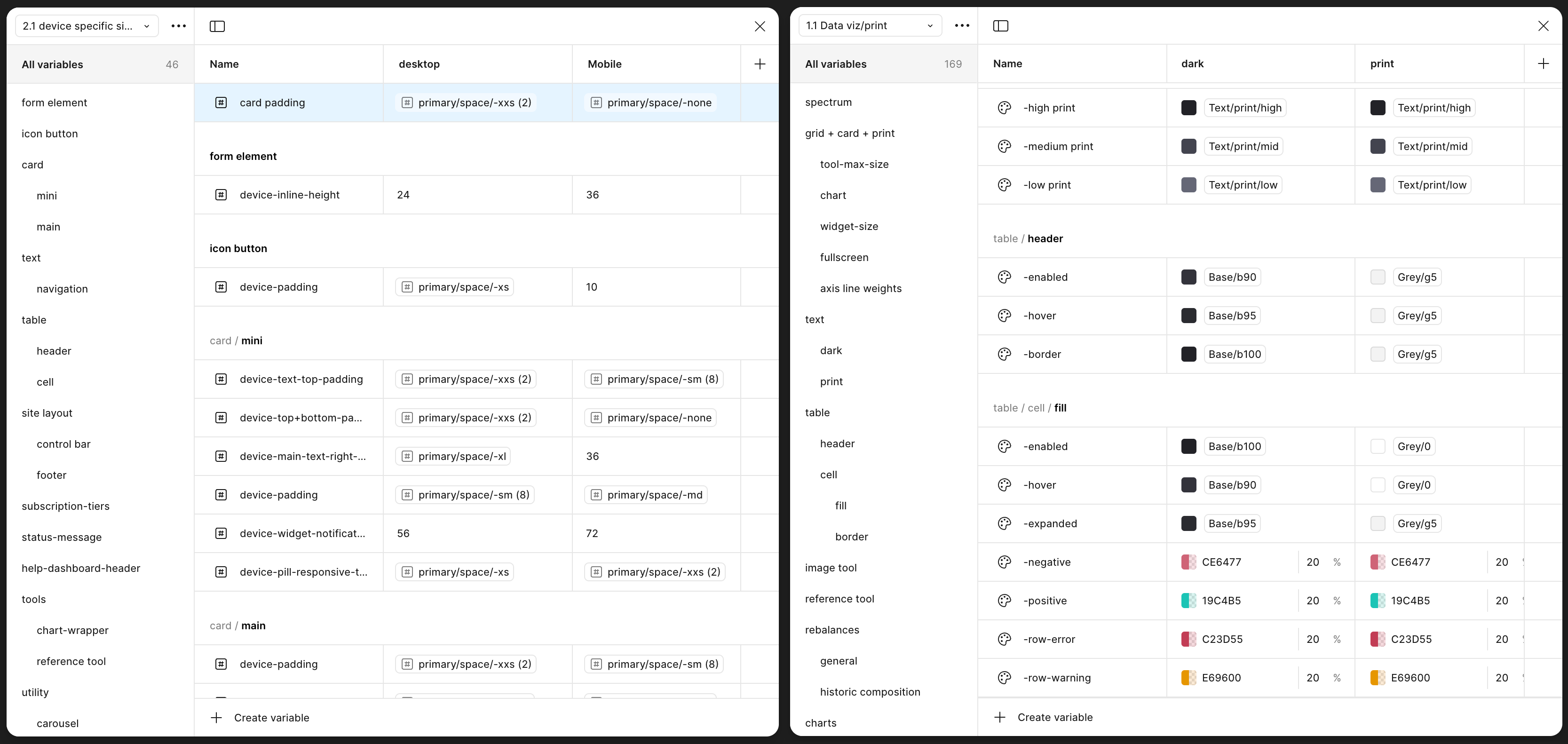
Once we were in Figma, the difference between the ways variables and colours were handled was wild. We immediately took advantage of their variables system. This was revolutionary for our design system because:
We could create light/dark mode variations without duplicate components
Colour themes could be swapped globally
We created base colours which then was used to populate more specific elements such as button styling etc.
We could create size variations (compact, standard, expanded) for different user preferences
Spacing could be adjusted systemwide with a few clicks.
This made our system incredibly adaptable. Creating a specific exportable reports using app elements was easily done on existing component with minimal manual labour required using modes.
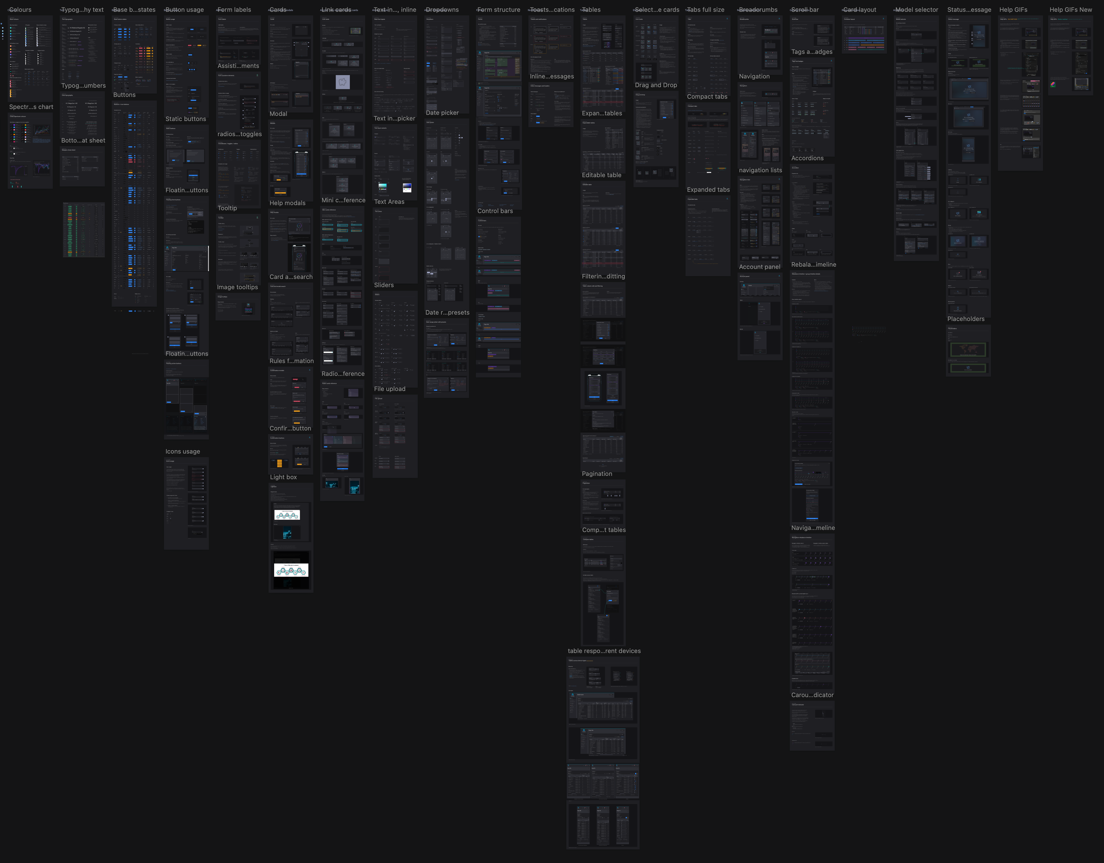
Component Structure: The Final Form
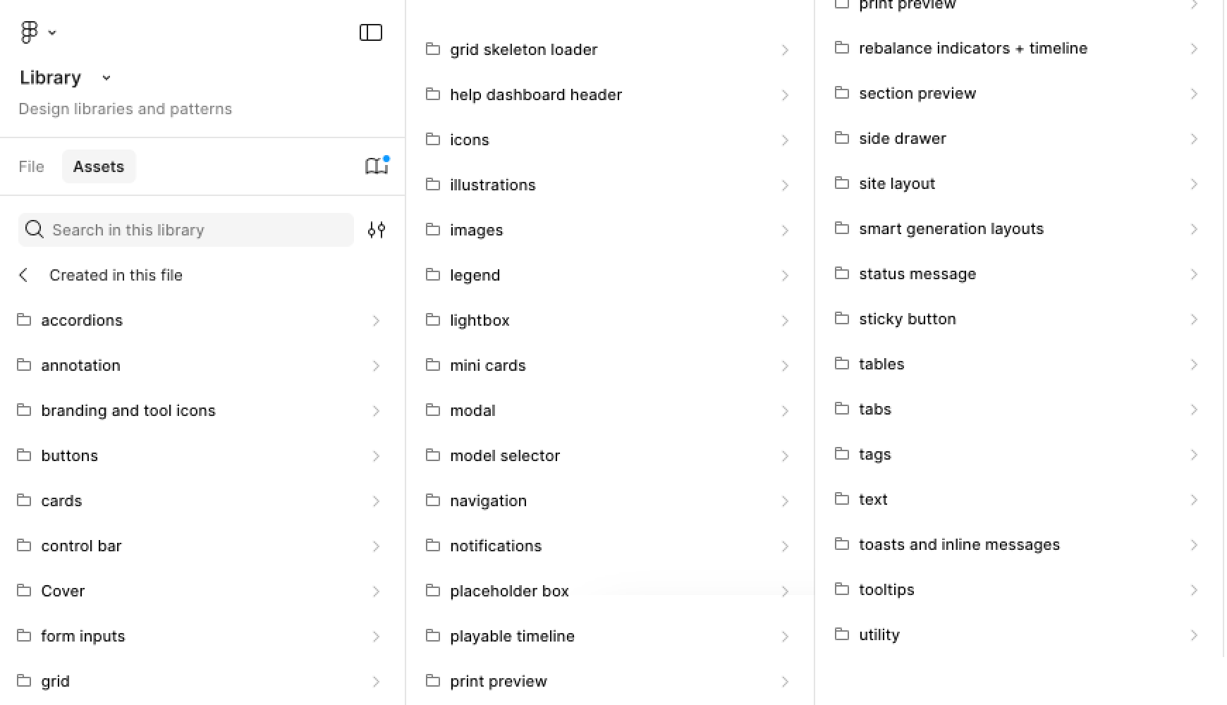
The last major phase was restructuring our component library for maximum efficiency and scalability. I organised the Figma file according to:
Atomic elements (colors, typography, icons)
Basic components (buttons, inputs, selections)
Compound components (cards, dialogs, panels)
Specialized financial components (data visualizations, calculators)
Page templates and layouts
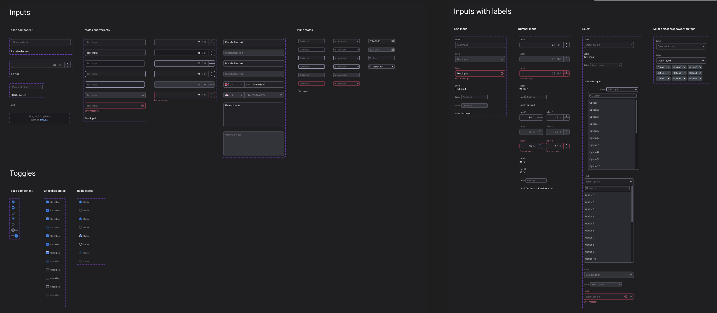
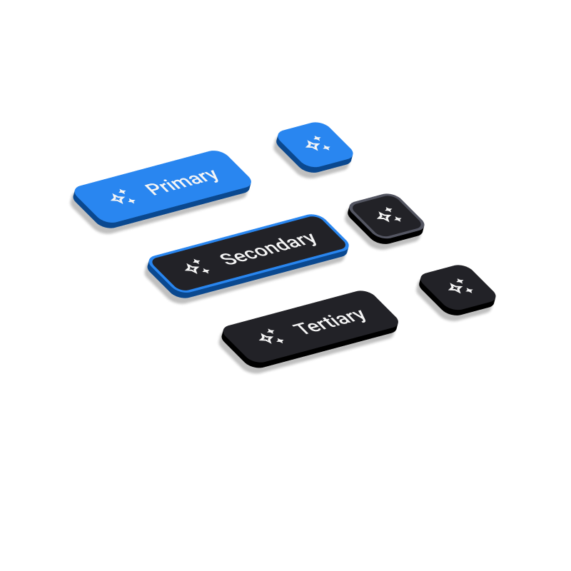
Each component was built with variants for different states and configurations.
The Results
Once we had a comprehensive design system it allowed us:
Reduced design time for new features
Created consistency across the entire application
Made onboarding new designers much faster (down from weeks to days)
Significantly improved developer handoff and implementation accuracy
Received positive feedback from our financial expert users for its clarity and usability
The system continues to evolve as we learn more about our users and their needs, but having this foundation has transformed how we work. What started as a reaction to an inherited mess became one of the company's most valuable design assets.
Lessons Learned
Looking back, the biggest takeaways from this project were:
Bespoke doesn't mean building everything from scratch - it means thoughtfully crafting what your specific users need.
Documentation is as important as the components themselves
Tool choice matters, but process matters more
Design systems are never "done" - they need room to grow and evolve
Building Noxai taught me that the best design systems aren't just collections of pretty UI elements - they're thoughtful frameworks that help teams build better products faster, especially for niche applications with specific user needs.