noxai branding

Overview
A new brand for a new era of finance.
Branding for Noxai, an analytics platform by Collidr Technologies, spanning logo design, visual identity, and cross-disciplinary collaboration.
I am halfway through writing this article but still want to show cool stuff off!
Details
Background
While retail fintech has moved quickly, with products like Monzo and Revolut reshaping personal banking and tools such as Chip simplifying saving and investing, institutional finance remains dominated by Excel workflows and rigid platforms. Even modern systems like Bloomberg AIM, BlackRock’s Aladdin, and our own Collidr prioritise guided, advice-led experiences over flexibility, leaving little room for teams that want to build their own analytics or reporting. This gap pointed to an opportunity to create a new product for smaller trading firms that value powerful tools without hand-holding. To succeed, the product needed not only a new technical foundation, but a modern, approachable brand that clearly differentiated it from traditional institutional software all while still felt very approachable and familiar.
First steps
We kicked off the project with stakeholder workshops and brand audits to align on Noxai’s personality, tone of voice, and overall vibe. This early phase established a shared direction and laid the foundation for a more modern and approachable financial analytics brand.

Brand dimensions used to guide early decisions
Ideation and refinement
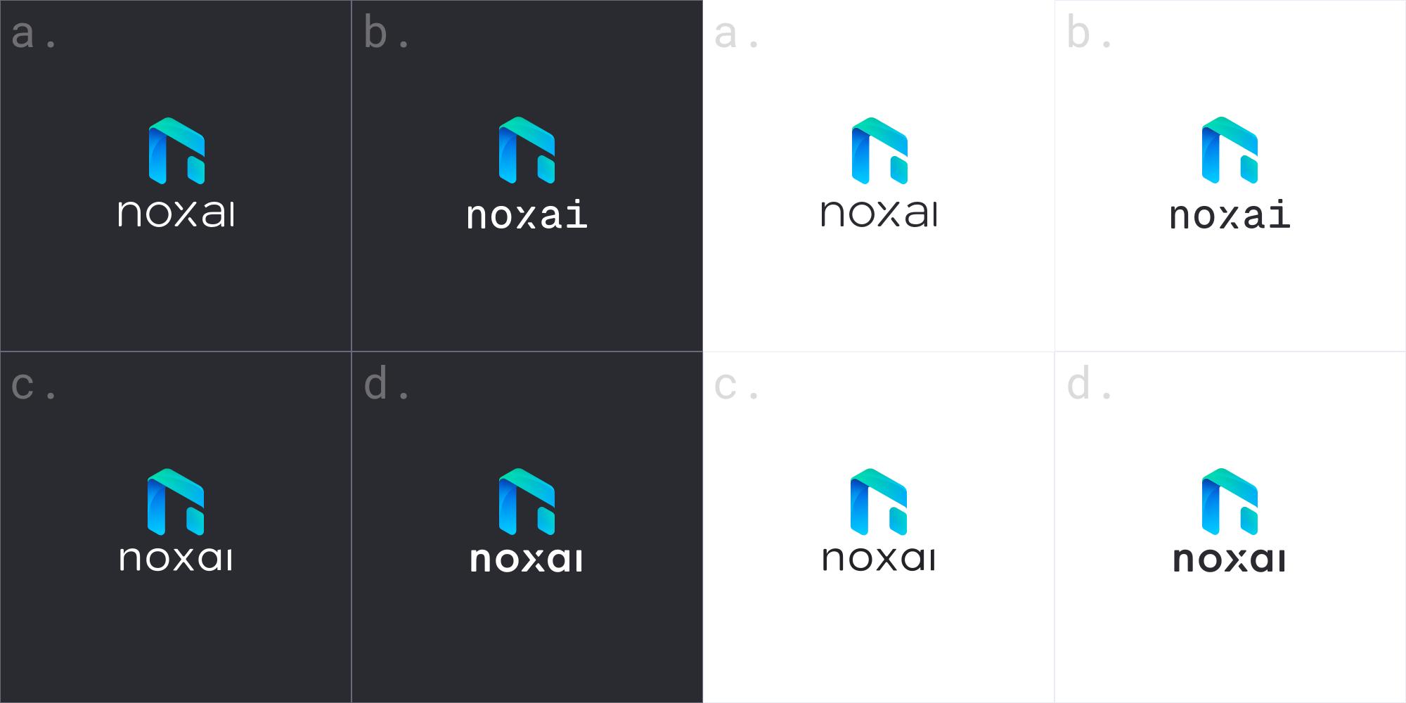
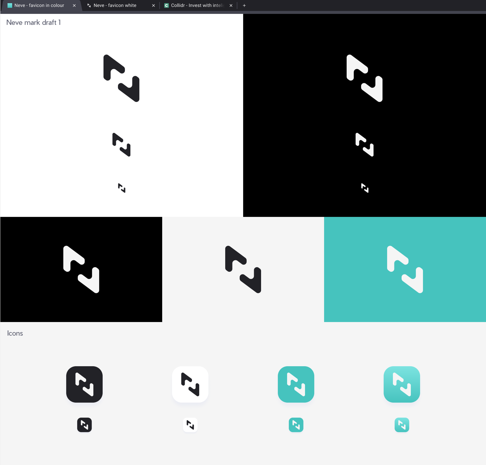
With the personality defined, we began exploring mark, naming and colour palettes. Naming proved particularly challenging due to the highly territorial nature of branding within the financial sector. The initial name was Neve, a very specific type of snow in italian. It was a good strong name and with that We started exploring Mark options. I wanted something with a strong bold outline, but still compatable with our old brand.
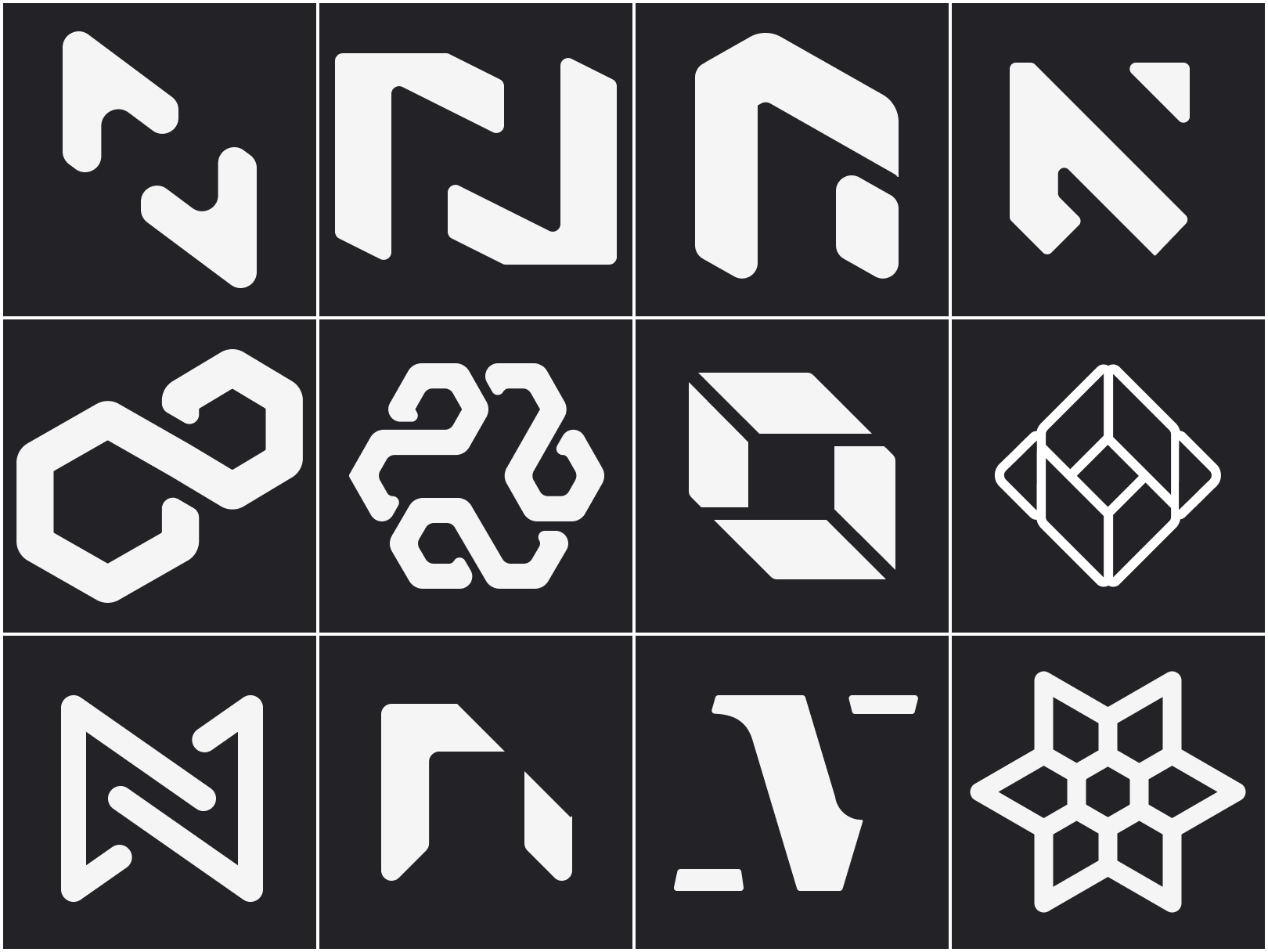
Explored many options, stylised N would have went pretty well with stylised C we have used in our other product.
At the end we shortlisted 3:
minimal stylised N,
The infity symbol(which was nod to our OLD branding)
Infinity symbol loop building to a circle shape reminiscent of snowflake and circuitry.
Once we had these we started playing with colours.
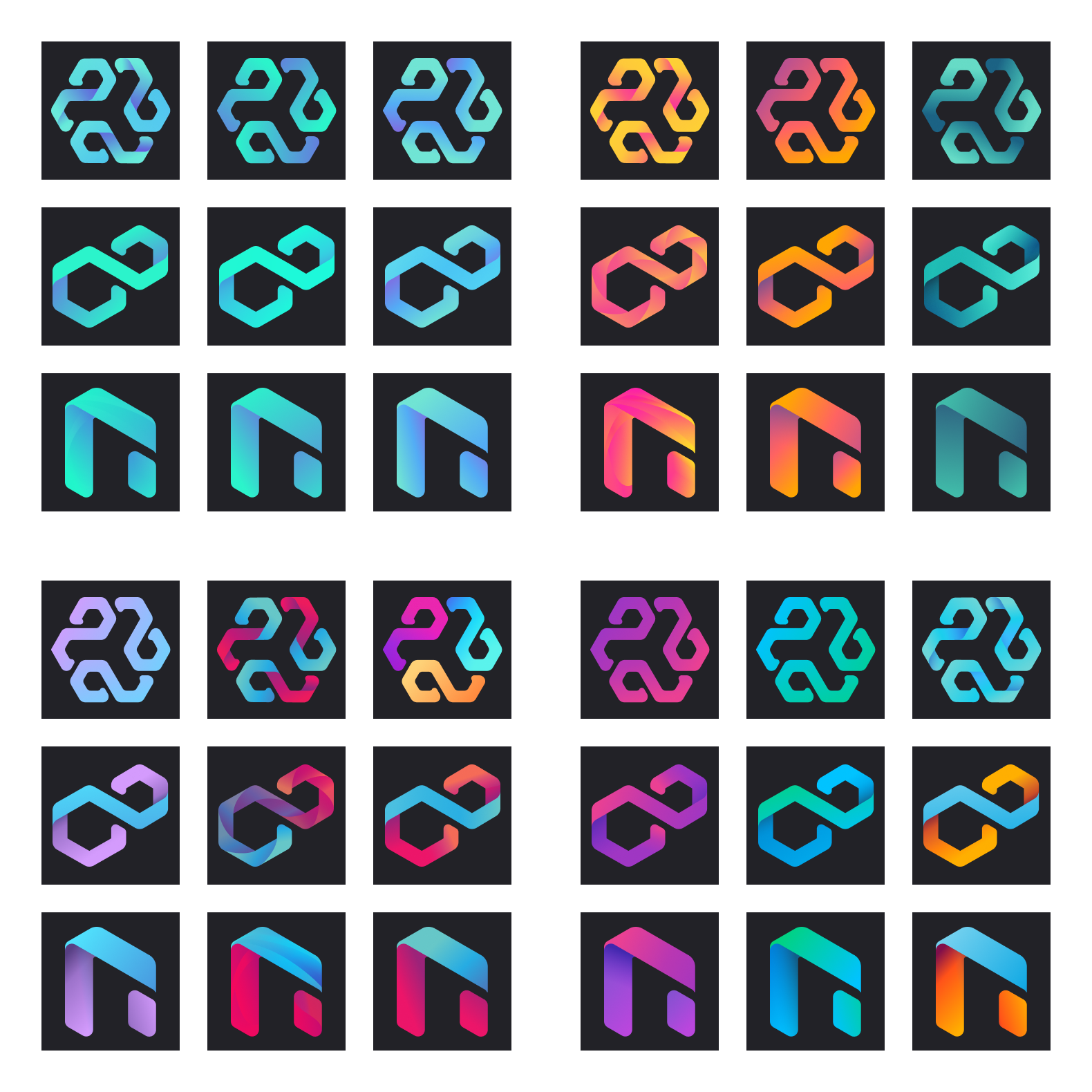
Since inicial name was inspired by snow we tried to lean more into coulder colours but not ruling out quite oposite warm tones.
Side note: Personal favourite
I really liked negative space N created by arrows pointing up and down, but it wasn't quite aligning with what other stakeholders were after. In the end I think it was just slightly too minimal.
Personal favorite
App colours
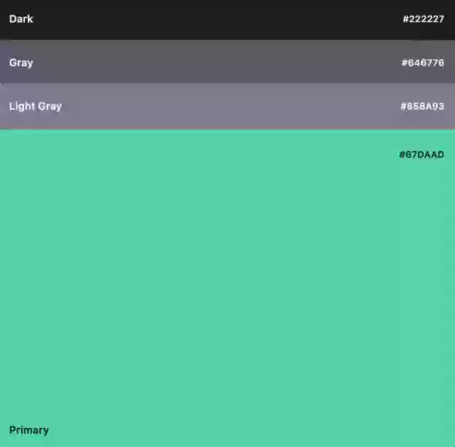
Colour palette
I am halfway through writing this article but still want to show cool stuff off!