plt checkout redesign
Overview
Checkout redesign: a solo mission in high-stakes UX Transforming PrettyLittleThing’s Conversion Funnel as sole Designer & Researcher(and living to tell the tale)
The landscape: diving into the pink abyss
In 2016, I found myself submerged in PLT’s pink-drenched hellscape – a world of pink, zero documentation, and competing stakeholder demands. The mission? Redesign a monolithic checkout process that had become the company’s most notorious revenue chokepoint. As the sole UX architect leading this enterprise overhaul, the stakes were clear: modernize the flow without diluting PLT’s aggressively bold identity, all while navigating a minefield of legacy Magento integrations, an impending transition to Worldpay, and backend constraints.
The existing checkout – a dated Magento template – set a painfully low benchmark. But ‘good enough’ wasn’t the goal. Partnering with engineering, I aimed to craft what stakeholders initially deemed impossible: a checkout that felt unmistakably PLT yet functioned with the precision of a luxury concierge service. Every decision balanced immediacy against future scalability, from Worldpay’s API limitations to mobile-first users who’d would abandon a cart at first hint of abrasion. This wasn’t a UI refresh. It was open-heart surgery on a platform processing eight figures weekly – and I was the lone designer holding the scalpel.
Details
Why this matters
Strategic priority: Executive-level focus with cross-functional dependencies
Technical constraints: Legacy systems requiring creative front-end solutions
My role: Solo designer driving end-to-end UX—research, strategy, UI, and stakeholder alignment
The approach
Discovery phase
Conducted abandoned basket analysis across user segments
Identified cognitive overload as the primary dropout driver
Established that PLT’s maximalist aesthetic needed balancing with functional minimalism
The redesign philosophy
Collaborating closely with developers, I reimagined the flow as a guided journey
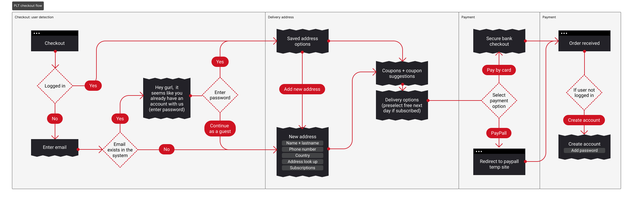
Gateway: account or guest?
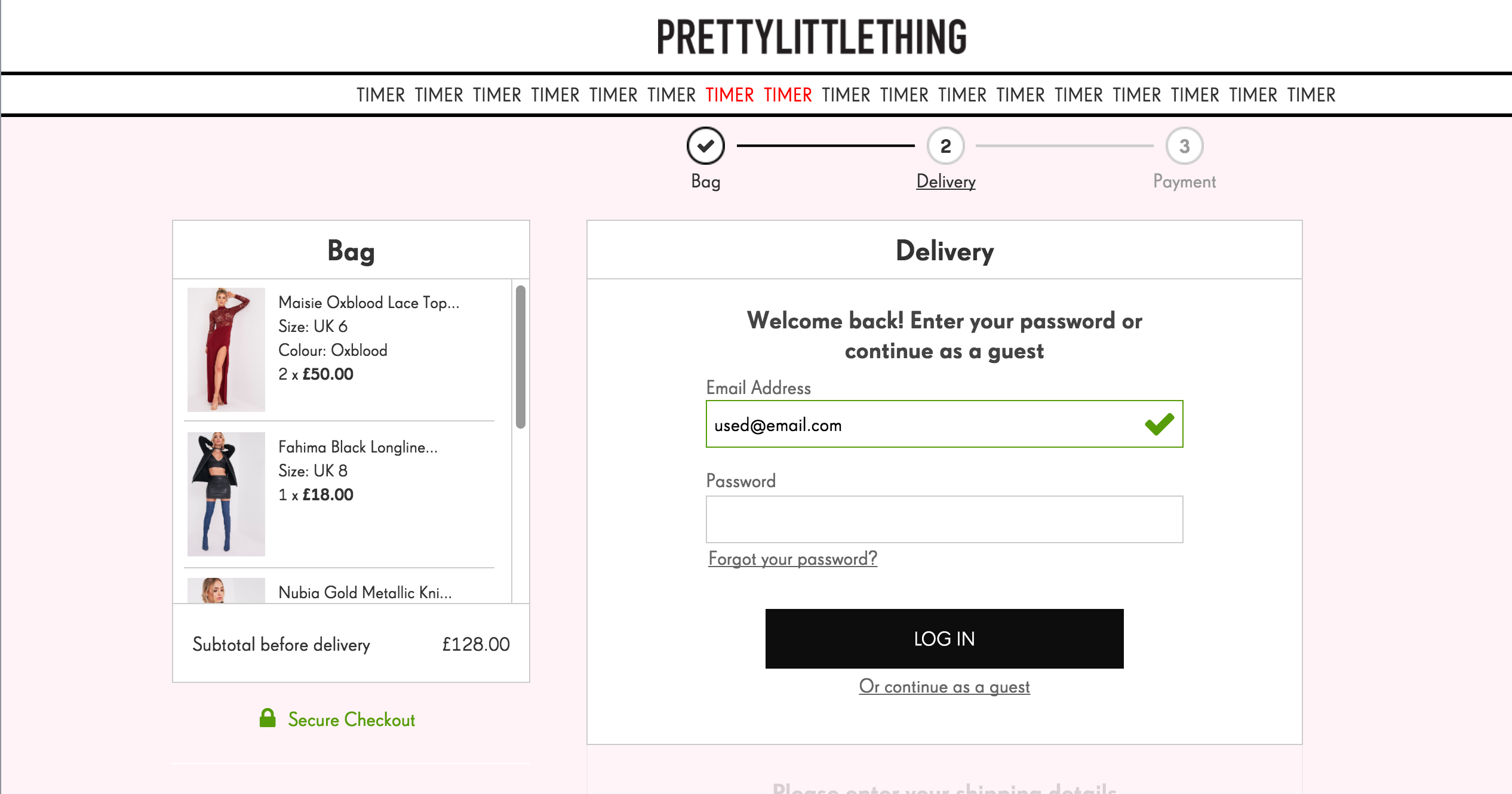
“Type in your email to get started” gently nudged users into the flow, while the “Continue as a guest” option mirrored account benefits (e.g., order tracking via email). This bifurcation reduced upfront friction without sacrificing future CRM opportunities. In addition researched showed that some people even if they had an account couldn't be bothered logging in, making guest option even more valuable.
Details: respecting user momentum
Returning users saw pre-validated details with a clear “Edit” option (applying the confirm, don’t ask principle).
Guest users encountered a minimalist “Shipping Details” form, requesting only mission-critical fields (First Name, Last Name, Phone Number, Address) and a “Subscribe to SMS” checkbox for delivery updates.
Coupon spotlight: feeding the deal-Hungry The prominent “Coupon Code” field (positioned pre-payment) capitalized on PLT’s promo-driven culture. By surfacing discounts within the checkout—rather than forcing users to abandon and search—we kept deal-seekers engaged.
Delivery: choice without chaos
Defaulted to “UK Standard Delivery” (cost-effective and familiar).
Upsold urgency with options like “Next Day Evening Shipping” and a “Unlimited Next Day Delivery” membership-style offer—a clever retention play disguised as convenience.
"Sticky" basket
More than a convenience – a psychological safety net
This real-time cart preview wasn’t just a UI component; it was a tool to retain users. While commonplace these days, back then it wasn't as present
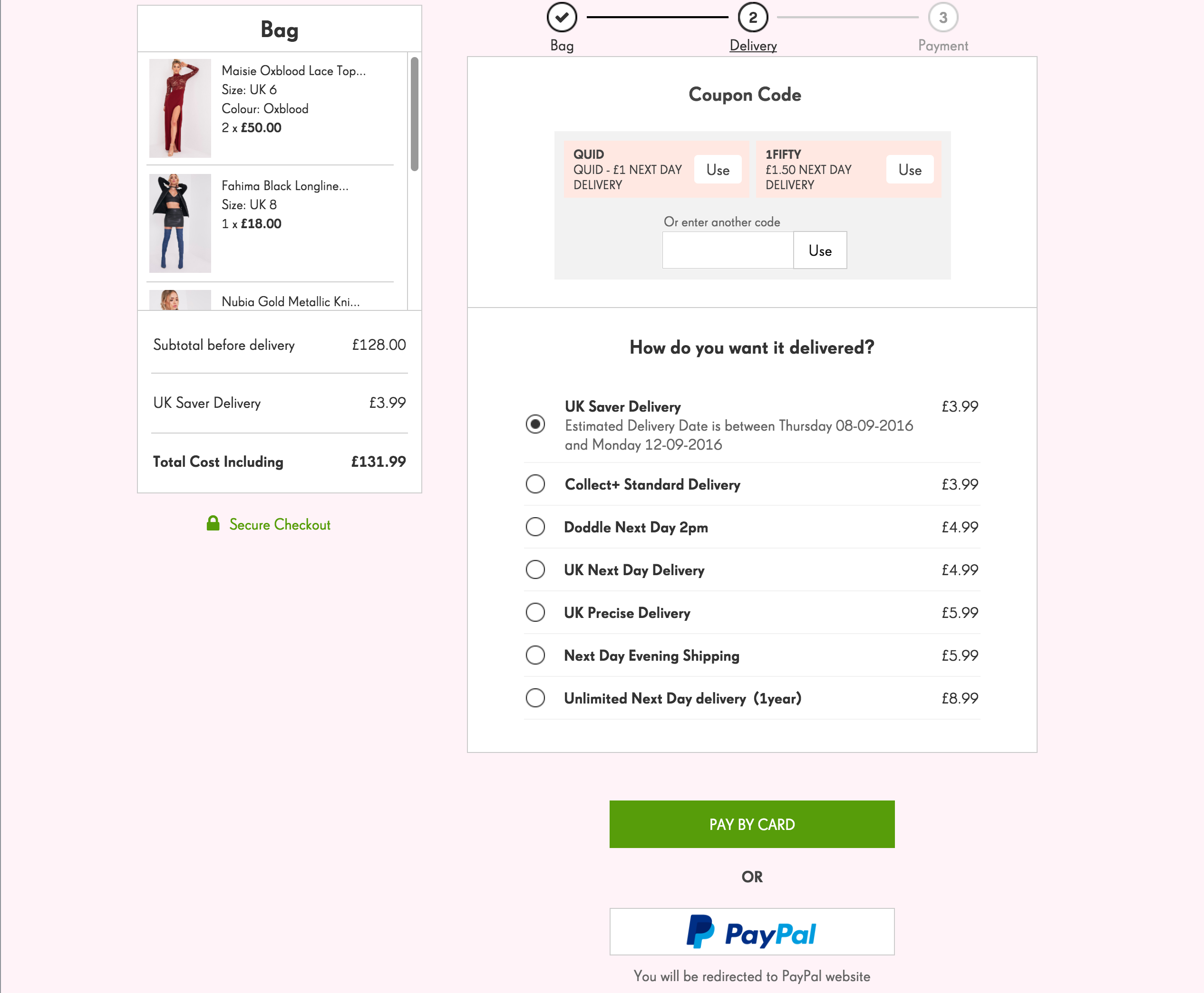
Ensuring clarity of pricing
Displayed item thumbnails, quantities, and dynamic pricing (e.g., “£3.99 → £2.99 after code”) to eliminate “Did I add that?” doubts.
Displaying that shipping cost is not available until shipping method is selected
Post shipping total
The rollout: slow and steady
Understanding the stakes of overhauling a revenue-critical system, we agreed on a phased release strategy:
10% of traffic: Initial exposure to surface glaring UX issues
20% → 50%: Stress-testing edge cases (e.g., promo code stacking)
80% → 100%: Final tuning for global audiences
Post-launch analytics revealed two key victories:
Double-digit conversion uplift – a boardroom-worthy validation of the redesign’s ROI.
Critical bug neutralized: Our monitoring caught a checkout-crashing edge case within 30minutes. Thanks to the phased approach, only couple of users were impacted before we deployed the hotfix.
Checking in on my long lost son
Reviewing PLT’s checkout flow nearly a decade after my initial redesign felt nostalgic. I’ll admit the team has done a great job evolving it since my departure. Glad to see they finally introduced express checkout—a feature that caused endless boardroom battles back then due to PayPal’s fees and thin margins. The new rebrand (beige is the new pink?) also adds a more credible tone to the experience.
Key insights
Solo efforts thrive on collaboration Cross-functional partnerships became the linchpin of success – developers translated bold interactions into reality, while PMs helped navigate stakeholder minefields.
Brand identity can integrate and define interfaces... even if it is overly bold. PLT’s vibrant aesthetic found harmony with function. flat pink accommodated security cues rather than competing with them, proving visual excess needn’t sacrifice usability.
Final reflections
This project revealed timeless truths about UX in high-pressure environments:
Complex systems crave clarity Stepped flows transformed a monolithic process into a streamlined journey, proving that structure liberates rather than constrains.
Simplicity and reassurance Tiny details – persistent baskets, discreet security badges, redirect warnings – collectively built confidence where flashy design often fails.
While my time in fast fashion remains ethically questionable, I’m grateful it served as my gateway into professional UX – and connected me with brilliant collaborators, many of whom became lifelong friends.